|
|
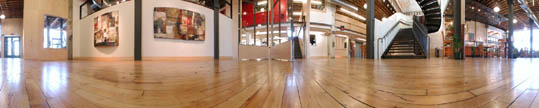
The intention was to create as random a distribution of letters as possible, in hopes of making them feel like they've always been there.
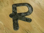
Letters include those spelling OPEN BOOK, as well as a few others thrown in (A,Q,R,M) for their interesting evolutions. The routings went to a depth of approximately 1/4 of an inch.
|
|
|
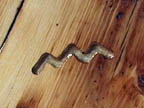
proto-sinaitic "M" - water
|
The earliest version of each letter character was cast in clear polyester resin. These pictographic characters are "transparent" to our contemporary writing. The intermediate versions (one or two, depending on the letter) were also cast in resin, but this time with bits of concrete "rocks" partially filling the routed-out space. The final, familiar latin forms are made with solid concrete.
|
 |